


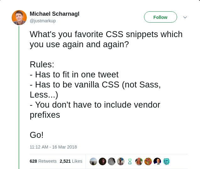
Best "tweet size" CSS Snippets ever
- Has to fit in one tweet
- Has to be vanilla CSS (not Sass, Less...)
- You don't have to include vendor prefixes
Here's the original Tweet
Actually most of the snippets I used once or more, and I found some interesting snippets too. I thought about writing a blog post displaying all these snippets in a better way than Twitter tweets as I don't like the view of tweets and replies,
So I'll try to add each useful snippet from the replies of the tweet.
One last thing I'll try to mention the names of every snippet's publisher but. I might not be able to mention all the names so you can Back to the tweet and check it.
#Let's start:
@justmarkup
1img, 2video { 3 max-width: 100%; 4 height: auto; 5}
1::selection { 2 color: #000; 3 background: #fbd404; 4}
1.clearfix::after { 2 content: ""; 3 display: table; 4 clear: both; 5}
1html { 2 box-sizing: border-box; 3}
1*, 2*::before, 3*::after { 4 box-sizing: inherit; 5}
1@media (prefers-reduced-motion: reduce) { 2 * { 3 animation: none !important; 4 transition: none !important; 5 } 6}
@anandgraves
1a { 2 color: inherit; 3} 4 5label, 6button, 7input, 8select { 9 cursor: pointer; 10}
@M_J_Robbins
Email client isolation;
1.★:not(#★) { 2 /* for targeting AOL */ 3} 4@media yahoo { 5 /* for targeting Yahoo */ 6} 7u + .body .foo { 8 /* for targeting Gmail */ 9} 10#MessageWebViewDiv .foo { 11 /* for targeting Samsung mail */ 12} 13[OWA] .foo { 14 /* for targeting http://Outlook.com */ 15}
@machtdesign
Tel-Link - to avoid error
1a[href^="tel"] { 2 white-space: nowrap; 3 pointer-events: none; 4 text-decoration: none; 5 color: inherit; 6} 7@media (max-width: 30em) { 8 a[href^="tel"] { 9 pointer-events: auto; 10 text-decoration: underline; 11 } 12}
@DasSurma
Reminded to put
alton your images:
1img:not([alt]), 2img[alt=""] { 3 outline: 5px solid red; 4}
@justmarkup
1img[alt*=".jpg"], 2img[alt*=".jpeg"], 3img[alt*=".gif"], 4img[alt*=".webp"], 5img[alt*=".png"], 6img[alt*="Photographer:"], 7img[alt*="Image of:"], 8img[alt*="Photo of:"], 9img:not([alt$="."]) { 10 outline: 5px solid orange; 11}
@Chrisedmo
A grid system in a tweet:
1.fukol-grid { 2 display: flex; 3 flex-wrap: wrap; 4 margin: -0.5em; 5} 6.fukol-grid > * { 7 flex: 1 0 5em; 8 margin: 0.5em; 9}
@radibit
Vertically centering everything:
1.🦄 { 2 display: flex; 3 align-items: center; 4 justify-content: center; 5}
@tajdidr
You can also use the grid layout 🙂
1body { 2 display: grid; 3 place-items: center; 4 height: 100vh; 5}
@ChrisJPatty
I use these material design box shadows constantly. box-shadow: 0 10px 20px rgba(0,0,0,0.19), 0 6px 6px rgba(0,0,0,0.23); Source
1.classname { 2 box-shadow: 0 10px 20px rgba(0, 0, 0, 0.19), 0 6px 6px rgba(0, 0, 0, 0.23); 3}
The next tweet will save you a lot of time if you faced this problem before 😄
@noncototient
When you have that on element causing horizontal scroll on the page and you don’t know what it is.
1* { 2 border: 1px solid red: 3}
@tzzoo
Target every child except the last one:
1li:not(:last-child) { 2 border-bottom: 1px solid; 3}
@laryro replied to the previous tweet
Or you could just do this (in case you just want to add a line between elements)
1li + li { 2 border-top: 1px solid; 3}
@jim_savage
scaling base value:
1:root { 2 font-size: 12px; 3} 4@media (min-width: 768px) { 5 :root { 6 font-size: 14px; 7 } 8} 9@media (min-width: 992px) { 10 :root { 11 font-size: 16px; 12 } 13} 14@media (min-width: 1200px) { 15 :root { 16 font-size: 18px; 17 } 18}
@ojrask
1label[for] { 2 cursor: pointer; 3}
@niksy
1abbr[title], 2acronym[title], 3dfn { 4 cursor: help; 5} 6 7img { 8 font-style: italic; 9} 10 11textarea { 12 resize: vertical; 13} 14 15[disabled] { 16 cursor: default; 17} 18 19[aria-disabled="true"] { 20 cursor: default; 21 pointer-events: none; 22} 23 24.no-js button[type="button"] { 25 display: none; 26}
@snitramordep
Vertical & center align
1.foo { 2 position: absolute; 3 top: 50%; 4 left: 50%; 5 transform: translate (-50% -50%); 6}
@michaelpumo Use flexbox for that instead!
1.foo { 2 display: flex; 3 align-items: center; 4 justify-content: center; 5}
@machtdesign
1a[href^="https://"]:hover:before { 2 content: "\f023"; /* fa-lock */ 3}
@diegoeis
/ better css reset of all time /
1* { 2 padding: 0; 3 margin: 0; 4 box-sizing: border-box; 5}
@ralfhoffmeister
1p { 2 max-width: 38em; 3}
@holger1411
1.class { 2 font-size: calc(1em + 1vw); 3}
@jenlampton
1.video-wrapper { 2 position: relative; 3 padding-bottom: 56.25%; /* 16:9 */ 4 padding-top: 25px; 5 height: 0; 6} 7.video-wrapper iframe { 8 position: absolute; 9 top: 0; 10 left: 0; 11 width: 100%; 12 height: 100%; 13}
@jordanmoore
1.class { 2 display: flex; 3 justify-content: space-between; 4}
It still feels like cheating, it’s so easy.
@brunotron3000
1.square { 2 height: 0; 3 padding-bottom: 100%; 4}
Since padding % is related to the element's width, with this code you can have a responsive square, adjust the % for different aspect ratios (56% for 16:9).
@Danno19008
1.ellipsis { 2 max-width: 200px; 3 overflow: hidden; 4 text-overflow: ellipsis; 5 white-space: nowrap; 6}
@_caseyjacobson
1svg { 2 fill: currentColor; 3}
@kg_creative
1.wrapper { 2 /* 16:9 */ 3 --ratio-h: 16; 4 --ratio-v: 9; 5 6 height: 0; 7 overflow: hidden; 8 padding-top: calc(var(--ratio-v) / var(--ratio-h) * 100%); 9 position: relative; 10} 11 12.wrapper > .element { 13 height: auto; 14 position: absolute; 15 width: 100%; 16}
@amiegrrl
1* { 2 -webkit-font-smoothing: antialiased; 3}
@ralfhoffmeister
1input:focus::placeholder, 2textarea:focus::placeholder { 3 color: transparent; 4} 5//don’t forget to vendor-prefix
@bkastl
1sub, 2sup { 3 line-height: 0; 4}
@mdstaicu
I'm not as cool as the CSS grid kids, I still use this for vertical alignment:
1.parent:before { 2 content: ""; 3 display: inline-block; 4 height: 100%; 5 vertical-align: middle; 6} 7 8.child { 9 display: inline-block; 10 vertical-align: middle; 11}
@ShaneHudson
I rely on
1input:checked + label { 2}
for a lot of things
@gerardkcohen
1.visually-hidden { 2 clip: rect(1px, 1px, 1px, 1px); 3 height: 1px; 4 overflow: hidden; 5 position: absolute; 6 white-space: nowrap; 7 width: 1px; 8}
@innovati
Print external URLS:
1@media print { 2 a { 3 text-decoration: underline; 4 } 5 [href]:not([href^="#"]):after { 6 content: " (" attr(href) ") "; 7 } 8}
Demo: https://t.co/QfxHSRbtL7
@RussellSkaggs
1.modal { 2 position: fixed; 3 top: 0; 4 bottom: 0; 5 left: -100%; 6 right: 100%; 7 opacity: 0; 8 transition: left 0s linear 0.5s, right 0s linear 0.5s, opacity 0.5s linear; 9} 10.modal-open { 11 left: 0; 12 right: 0; 13 opacity: 1; 14 transition: left 0s linear, right 0s linear, opacity 0.5s linear; 15}
@RussellSkaggs
1.btn { 2 display: inline-flex; 3 align-content: center; 4 align-items: center; 5}
@IschaGast
1@media (inverted-colors) { 2 img, 3 video { 4 filter: invert(100%); 5 } 6 7 * { 8 box-shadow: none !important; 9 text-shadow: none !important; 10 } 11}
@keithjgrant
Space out children of a box
1.box { 2 padding: 1em; 3} 4 5.box > :first-child { 6 margin-top: 0; 7} 8 9.box > :last-child { 10 margin-bottom: 0; 11} 12 13.box > * + * { 14 margin-top: 1em; 15}
@jim_savage
Giving a DIV a custom sized ratio.
1div { 2 --ratio-x: 16; 3 --ratio-y: 9; 4 position: relative; 5} 6 7div::before { 8 display: block; 9 content: ""; 10 padding-top: calc(var(--ratio-y) / var(--ratio-x) * 100%); 11}
@Eramdam
1.easyCenter { 2 display: flex; 3 flex-direction: column; 4 justify-content: center; 5 align-items: center; 6}
who said centering in CSS was still hard? 😛
@MichaelWhyte
Get list ready for navigation:
1ul { 2 margin: 0; 3 padding: 0; 4 list-style: none; 5 display: flex; 6}
@adamtomat
1img { 2 vertical-align: middle; 3} 4``` 5 Removes 6 that 7 bit 8 of 9 white 10 space 11 under 12 an 13 image 14 -------- 15 @TobiReif 16 ```css 17 body { 18 overscroll-behavior: none; 19}
@nice2meatu
1.svg-inline { 2 position: relative; 3 top: 0.125em; 4 height: 1em; 5 width: 1em; 6 flex-shrink: 0; 7}
(last line only relevant when used inside a flex-container)
@LucP
1::root { 2 --min-col-width: 250px; 3} 4 5.overview { 6 display: grid; 7 grid-template-columns: repeat(auto-fit, minmax(var(--min-col-width), 1fr)); 8}
@MattWilcox
1.calmUppercase { 2 font-size: 0.9em; 3 letter-spacing: 0.05em; 4} /* No need to shout, just because you’re uppercase */
@pxandbeyond
1p { 2 max-width: 75ch; 3}
limits the max-width to 75 characters
1.foo { 2 margin-right: 1ch; 3}
adds 1 character space where needed
@antikris77
1picture { 2 position: relative; 3 overflow: hidden; 4} 5 6picture:before { 7 content: ""; 8 display: block; 9 padding-top: 56.25%; /* 16:9 */ 10} 11 12picture img { 13 position: absolute; 14 left: 50%; 15 top: 50%; 16 transform: translate(-50%, -50%); 17 width: 100%; 18 height: 100%; 19 object-fit: cover; 20}
@argyleink
1@keyframes present-yourself { 2 to { 3 opacity: 1; 4 transform: translated(1, 1, 1); 5 } 6}
Used like:
1button { 2 opacity: 0; 3 transform: translateX(1rem); 4 animation: present-yourself 0.2s ease forwards; 5}
Node presents itself when attached to DOM
@GustavoRSSilva
1absolute-center: { 2 position: absolute; 3 left: 50%; 4 top: 50%; 5 transform: translate(-50%, -50%); 6}
@FPresencia
Magic container responsiveness for all screen sizes:
1.container { 2 width: calc(100% - 40px); 3 max-width: 1200px; 4 margin: 0 auto; 5}
@selbekk
Great way to sync media queries with your javascript:
1body::before { 2 content: ‘small’, 3 display: none; 4} 5@media all and (min-width: 1000px) { 6 body::before { 7 content: ‘medium’; 8 } 9} 10@media all and (min-width: 1200px) { 11 body::before { 12 content: ‘large’; 13 } 14}
@stephenmurdoch
1// remove default styles 2button { 3 appearance: none; 4} 5 6// poor man's no-js checkbox toggler 7input[type="checkbox"] ~ div { 8 visibility: hidden; 9} 10input[type="checkbox"]:checked ~ div { 11 visibility: visible; 12}
I usually pair the above with a label, and then hide the checkbox.
@wwwulkan
Makes any text that is too long have 3 dots after it. It's awesome for when you're tight on horizontal space.
1.truncated { 2 display: block; 3 white-space: nowrap; 4 overflow: hidden; 5 text-overflow: ellipsis; 6 max-width: 15rem; 7}
@gups
1.transition-everything { 2 transition: 300ms ease-in; 3}
I know that I did nothing I just copy/paste the tweets content, But I think code here is much better than twitter and I want to use all the new snippets later. If you have any snippets Just comment below and I'll add it soon with your name.
We can make this post as a great resource for css snippets